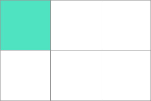
Grid Cell
In a CSS grid layout, a grid cell is the smallest unit you can have on your CSS grid. It is the space between four intersecting grid lines and conceptually much like a table cell.

If you do not place items using one of the grid placement methods, direct children of the grid container will be placed one into each individual grid cell by the auto-placement algorithm. Additional row or column tracks will be created to create enough cells to hold all items.
Example
In the example we have created a three column track grid. The five items are placed into grid cells working along an initial row of three grid cells, then creating a new row for the remaining two.
.wrapper {
  display: grid;
  grid-template-columns: repeat(3, 1fr);
  grid-auto-rows: 100px;
}
<div class="wrapper">
  <div>One</div>
  <div>Two</div>
  <div>Three</div>
  <div>Four</div>
  <div>Five</div>
</div>