Fundamental layout comprehension
If you have worked through this module then you will have already covered the basics of what you need to know to do CSS layout today, and to work with older CSS as well. This task will test some of your knowledge by the way of developing a simple webpage layout using a variety of techniques.
| Prerequisites: | Before attempting this assessment you should have already worked through all the articles in this module. |
|---|---|
| Objective: | To test comprehension of CSS layout methods using flexbox, grid, floating and positioning. |
Starting point
You can download the HTML, CSS, and a set of six images here.
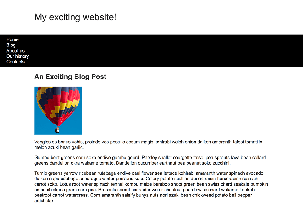
Save the HTML document and stylesheet into a directory on your computer, and add the images into a folder named images. Opening the index.html file in a browser should give you a page with basic styling but no layout, which should look something like the image below.

This starting point has all of the content of your layout as displayed by the browser in normal flow.
Alternatively, you could use an online editor such as CodePen, JSFiddle, or Glitch.
If you use an online editor, you will need to upload the images and replace the values in the src attributes to point to the new image locations.
Note: If you get stuck, you can reach out to us in one of our communication channels.
Project brief
You have been provided with some raw HTML, basic CSS, and images — now you need to create a layout for the design.
Your tasks
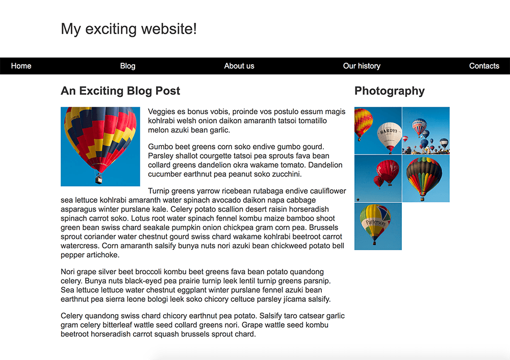
You now need to implement your layout. The tasks you need to achieve are:
- To display the navigation items in a row, with an equal amount of space between the items.
- The navigation bar should scroll with the content and then become stuck at the top of the viewport when it reaches it.
- The image that is inside the article should have text wrapped around it.
- The
<article>and<aside>elements should display as a two column layout. The columns should be a flexible size so that if the browser window shrinks smaller the columns become narrower. - The photographs should display as a two column grid with a 1 pixel gap between the images.
Hints and tips
You will not need to edit the HTML in order to achieve this layout and the techniques you should use are:
- Flexbox
- Grid
- Floating
- Positioning
There are a few ways in which you could achieve some of these tasks, and there often isn't a single right or wrong way to do things. Try a few different approaches and see which works best. Make notes as you experiment.
