Test your skills: Flexbox
The aim of this skill test is to assess whether you understand how flexbox and flex items behave. Below are four common design patterns that you might use flexbox to create. Your task is to build them.
Note: Click "Play" in the code blocks below to edit the examples in the MDN Playground. You can also copy the code (click the clipboard icon) and paste it into an online editor such as CodePen, JSFiddle, or Glitch. If you get stuck, you can reach out to us in one of our communication channels.
Task 1
In this task, the list items are the navigation for a site. They should be laid out as a row, with an equal amount of space between each item.
Your final result should look like the image below:

Try to update the code below to recreate the finished example:
<nav>
  <ul>
    <li><a href="/">Home</a></li>
    <li><a href="/about">About Us</a></li>
    <li><a href="/products">Our Products</a></li>
    <li><a href="/contact">Contact Us</a></li>
  </ul>
</nav>
nav ul {
}
Click here to show the solution
You can apply display: flex and control spacing using the justify-content property:
nav ul {
  display: flex;
  justify-content: space-between;
}
Task 2
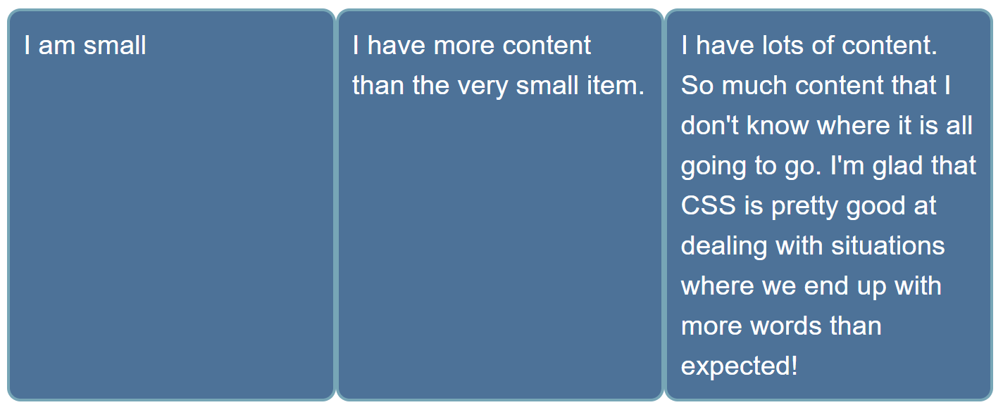
In this task, the list items are all different sizes, but we want them to be displayed as three equal sized columns, no matter what content is in each item.
Your final result should look like the image below:

Bonus question: Can you now make the first item twice the size of the other items?
Try to update the code below to recreate the finished example:
<ul>
  <li>I am small</li>
  <li>I have more content than the very small item.</li>
  <li>
    I have lots of content. So much content that I don't know where it is all
    going to go. I'm glad that CSS is pretty good at dealing with situations
    where we end up with more words than expected!
  </li>
</ul>
ul {
}

li {
}
Click here to show the solution
It's best to use shorthands, so in this scenario flex: 1 is probably the best answer, and so the most optimal result would be:
ul {
  display: flex;
}

li {
  flex: 1;
}
For the bonus question, add a selector that targets the first element and sets flex: 2; (or flex: 2 0 0; or flex-grow: 2):
li:first-child {
  flex: 2;
}
Task 3
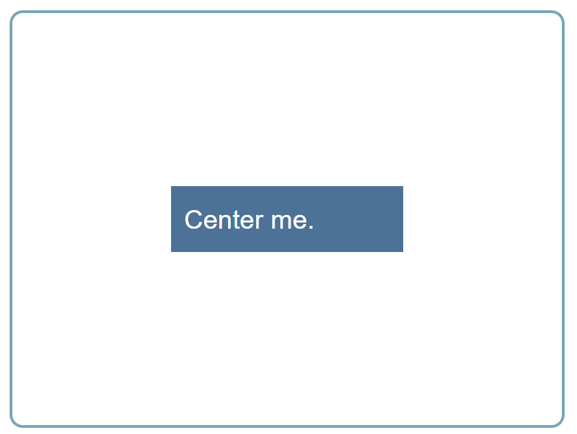
In this task, there are two elements in the HTML below, a <div> element with a class of parent which contains another <div> element with a class of child. Use flexbox to center the child inside the parent. There is more than one possible solution here.
Your final result should look like the image below:

Try to update the code below to recreate the finished example:
<div class="parent">
  <div class="child">Center me.</div>
</div>
Click here to show the solution
It's only necessary to change the parent styles to center an item horizontally and vertically:
.parent {
  display: flex;
  justify-content: center;
  align-items: center;
}
Task 4
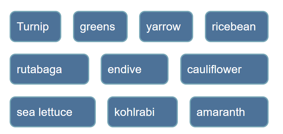
In this task, we want you to arrange these items into rows as in the image below:

Try to update the code below to recreate the finished example:
<ul>
  <li>Turnip</li>
  <li>greens</li>
  <li>yarrow</li>
  <li>ricebean</li>
  <li>rutabaga</li>
  <li>endive</li>
  <li>cauliflower</li>
  <li>sea lettuce</li>
  <li>kohlrabi</li>
  <li>amaranth</li>
</ul>
ul {
}

li {
}
Click here to show the solution
This task requires an understanding of the flex-wrap property to wrap flex lines. In addition, to ensure that you end up with something that looks like the example, you need to set flex: auto on the child (or flex: 1 1 auto;).
ul {
  display: flex;
  flex-wrap: wrap;
}

li {
  flex: auto;
}