animation-timing-function
The animation-timing-function CSS property sets how an animation progresses through the duration of each cycle.
Try it
animation-timing-function: linear;
animation-timing-function: ease-in-out;
animation-timing-function: steps(5, end);
animation-timing-function: cubic-bezier(0.1, -0.6, 0.2, 0);
<section class="flex-column" id="default-example">
  <div class="animating" id="example-element"></div>
  <button id="play-pause">Play</button>
</section>
#example-element {
  animation-duration: 3s;
  animation-iteration-count: infinite;
  animation-name: slide;
  animation-play-state: paused;
  background-color: #1766aa;
  border-radius: 50%;
  border: 5px solid #333;
  color: white;
  height: 150px;
  margin: auto;
  margin-left: 0;
  width: 150px;
}

#example-element.running {
  animation-play-state: running;
}

#play-pause {
  font-size: 2rem;
}

@keyframes slide {
  from {
    background-color: orange;
    color: black;
    margin-left: 0;
  }
  to {
    background-color: orange;
    color: black;
    margin-left: 80%;
  }
}
"use strict";

window.addEventListener("load", () => {
  const el = document.getElementById("example-element");
  const button = document.getElementById("play-pause");

  button.addEventListener("click", () => {
    if (el.classList.contains("running")) {
      el.classList.remove("running");
      button.textContent = "Play";
    } else {
      el.classList.add("running");
      button.textContent = "Pause";
    }
  });
});
It is often convenient to use the shorthand property animation to set all animation properties at once.
Syntax
/* Keyword values */
animation-timing-function: ease;
animation-timing-function: ease-in;
animation-timing-function: ease-out;
animation-timing-function: ease-in-out;
animation-timing-function: linear;
animation-timing-function: step-start;
animation-timing-function: step-end;

/* cubic-bezier() function values */
animation-timing-function: cubic-bezier(0.42, 0, 1, 1); /* ease-in */
animation-timing-function: cubic-bezier(0, 0, 0.58, 1); /* ease-out */
animation-timing-function: cubic-bezier(0.42, 0, 0.58, 1); /* ease-in-out */

/* linear() function values */
animation-timing-function: linear(0, 0.25, 1);
animation-timing-function: linear(0 0%, 0.25 50%, 1 100%);
animation-timing-function: linear(0, 0.25 50% 75%, 1);
animation-timing-function: linear(0, 0.25 50%, 0.25 75%, 1);

/* steps() function values */
animation-timing-function: steps(4, jump-start);
animation-timing-function: steps(10, jump-end);
animation-timing-function: steps(20, jump-none);
animation-timing-function: steps(5, jump-both);
animation-timing-function: steps(6, start);
animation-timing-function: steps(8, end);

/* Multiple animations */
animation-timing-function: ease, step-start, cubic-bezier(0.1, 0.7, 1, 0.1);

/* Global values */
animation-timing-function: inherit;
animation-timing-function: initial;
animation-timing-function: revert;
animation-timing-function: revert-layer;
animation-timing-function: unset;
Values
<easing-function>-
The easing function that corresponds to a given animation, as determined by
animation-name.The non-step keyword values (
ease,linear,ease-in-out, etc.) each represent cubic Bézier curves with fixed four-point values, while thecubic-bezier()function value allows non-predefined values to be specified. Thesteps()easing function divides the input time into a specified number of equal-length intervals. Its parameters include a number of steps and a step position.linear-
Equal to
cubic-bezier(0.0, 0.0, 1.0, 1.0), animates at an even speed. ease-
Equal to
cubic-bezier(0.25, 0.1, 0.25, 1.0), the default value, increases in velocity towards the middle of the animation, slowing back down at the end. ease-in-
Equal to
cubic-bezier(0.42, 0, 1.0, 1.0), starts off slowly, with the speed of the transition of the animating property increasing until complete. ease-out-
Equal to
cubic-bezier(0, 0, 0.58, 1.0), starts quickly, slowing down the animation continues. ease-in-out-
Equal to
cubic-bezier(0.42, 0, 0.58, 1.0), with the animating properties slowly transitioning, speeding up, and then slowing down again. cubic-bezier(<number [0,1]> , <number> , <number [0,1]> , <number>)-
An author defined cubic-bezier curve, where the first and third values must be in the range of 0 to 1.
linear(<number> <percentage>{1,2}, …)-
The function interpolates linearly between the provided easing stop points. A stop point is a pair of an output progress and an input percentage. The input percentage is optional and is inferred if not specified. If an input percentage is not provided then the first and last stop points are set to
0%and100%respectively, and the stop points in the middle receive percentage values derived by linearly interpolating between the closest previous and next points that have a percentage value. steps(<integer>, <step-position>)-
Displays an animation iteration along n stops along the transition, displaying each stop for equal lengths of time. For example, if n is 5, there are 5 steps. Whether the animation holds temporarily at 0%, 20%, 40%, 60% and 80%, on the 20%, 40%, 60%, 80% and 100%, or makes 5 stops between the 0% and 100% along the animation, or makes 5 stops including the 0% and 100% marks (on the 0%, 25%, 50%, 75%, and 100%) depends on which of the following step position is used:
jump-start-
Denotes a left-continuous function, so that the first jump happens when the animation begins.
jump-end-
Denotes a right-continuous function, so that the last jump happens when the animation ends. This is the default.
jump-none-
There is no jump on either end, effectively removing a step during the interpolation iteration. Instead, it holds at both the 0% mark and the 100% mark, each for 1/n of the duration.
jump-both-
Includes pauses at both the 0% and 100% marks, effectively adding a step during the animation iteration.
start-
Same as
jump-start. end-
Same as
jump-end.
step-start-
Equal to
steps(1, jump-start) step-end-
Equal to
steps(1, jump-end)
Note:
When you specify multiple comma-separated values on an animation-* property, they are applied to the animations in the order in which the animation-names appear. For situations where the number of animations and animation-* property values do not match, see Setting multiple animation property values.
Note: animation-timing-function has the same effect when creating CSS scroll-driven animations as it does for regular time-based animations.
Description
Easing functions may be specified on individual keyframes in a @keyframes rule. If no animation-timing-function is specified on a keyframe, the corresponding value of animation-timing-function from the element to which the animation is applied is used for that keyframe.
Within a keyframe, animation-timing-function is an at-rule-specific descriptor, not the property of the same name. The timing is not being animated. Rather, a keyframe's easing function is applied on a property-by-property basis from the keyframe on which it is specified until the next keyframe specifying that property, or until the end of the animation if there is no subsequent keyframe specifying that property. As a result, an animation-timing-function specified on the 100% or to keyframe will never be used.
Formal definition
| Initial value | ease |
|---|---|
| Applies to | all elements, ::before and ::after pseudo-elements |
| Inherited | no |
| Computed value | as specified |
| Animation type | Not animatable |
Formal syntax
animation-timing-function =
  <easing-function>#

<easing-function> =
  <linear-easing-function>        |
  <cubic-bezier-easing-function>  |
  <step-easing-function>

<linear-easing-function> =
  linear      |
  <linear()>

<cubic-bezier-easing-function> =
  ease              |
  ease-in           |
  ease-out          |
  ease-in-out       |
  <cubic-bezier()>

<step-easing-function> =
  step-start  |
  step-end    |
  <steps()>

<linear()> =
  linear( [ <number> && <percentage>{0,2} ]# )

<cubic-bezier()> =
  cubic-bezier( [ <number [0,1]> , <number> ]#{2} )

<steps()> =
  steps( <integer> , <step-position>? )

<step-position> =
  jump-start  |
  jump-end    |
  jump-none   |
  jump-both   |
  start       |
  end
Examples
All the examples in this section animate the width and background-color properties of several <div> elements with different animation-timing-function values. The width is being animated from 0 to 100%, and the background color is being animated from lime to magenta.
Linear function examples
The example demonstrates the effects of various linear() easing function values.
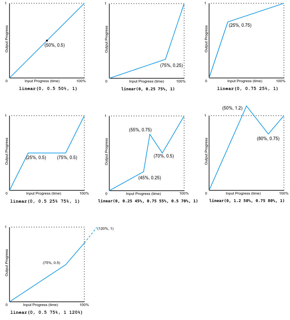
The following image shows graphs of all the linear() function values used in this example. Input progress (time) is plotted on the x-axis and output progress is plotted on the y-axis. As per the syntax, the input progress ranges from 0 to 100%, and the output ranges from 0 to 1.

Note that the output can go forward or backward.
Cubic-Bézier examples
The example demonstrates the effects of various bézier curve easing functions.
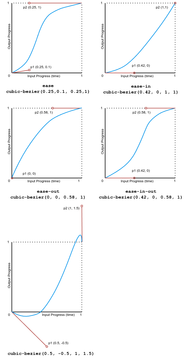
The following image shows graphs of all the cubic bézier function values used in this example. The input progress (time) ranges from 0 to 1 and the output progress ranges from 0 to 1.

Step examples
This example demonstrates the effects of several step easing function values.
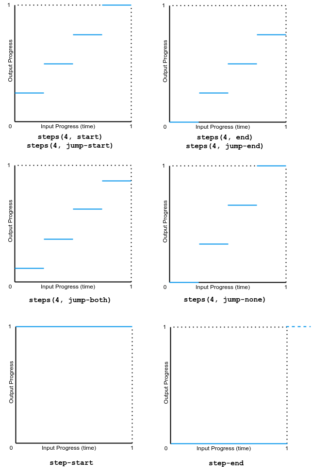
The following image shows graphs of all the step() function values used in this example. The input progress (time) and output progress range from 0 to 1.

Specifications
Browser compatibility
See also
- Using CSS animations
<easing-function>- JavaScript
AnimationEventAPI - Cubic bézier generation tool
- Other related animation properties:
animation,animation-composition,animation-delay,animation-direction,animation-duration,animation-fill-mode,animation-iteration-count,animation-name,animation-play-state,animation-timeline