<ratio>
Baseline Widely available
This feature is well established and works across many devices and browser versions. It’s been available across browsers since July 2015.
The <ratio> CSS data type describes the proportional relationship between a width and height. It is used as a value for the aspect-ratio media feature in @media media queries, the aspect-ratio size feature in @container container queries, and as a value for the CSS aspect-ratio property.
Syntax
The <ratio> data type is a <number> followed by a forward slash ('/', Unicode U+002F SOLIDUS) and a second <number>. Both numbers must be positive. Spaces before and after the slash are optional. The first number represents the width, while the second represents the height. In addition a single <number> as a value is allowable.
Common aspect ratios
| Ratio | Usage | |
|---|---|---|
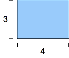
4/3 or 1.33333 |
 |
Traditional TV format in the twentieth century. |
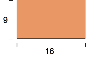
16/9 or 1.7777778 |
 |
Modern "widescreen" TV format. |
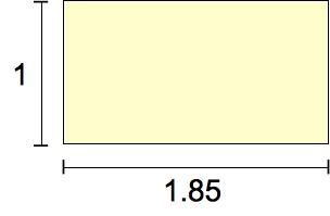
185/100 or 1.85 |
 |
The most common movie format since the 1960s. |
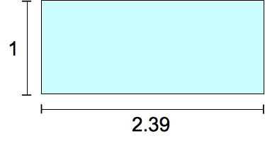
239/100 or 2.39 |
 |
"Widescreen," anamorphic movie format. |
Formal syntax
<ratio> =
  <number [0,∞]> [ / <number [0,∞]> ]?
Examples
Use in a media query
@media screen and (min-aspect-ratio: 16/9) {
  /* … */
}
Use in a @container size query
@container (aspect-ratio > 1) and (width < 20em) {
  /* … */
}
Use as a CSS property value
.square {
  aspect-ratio: 1 / 1;
}
.circle {
  aspect-ratio: 1;
  border-radius: 50%;
}
.portrait {
  aspect-ratio: 5 / 7;
}
Specifications
| Specification |
|---|
| CSS Values and Units Module Level 4 # ratio-value |
Browser compatibility
BCD tables only load in the browser
See also
aspect-ratiomedia descriptor- Understanding aspect ratios
- CSS container queries guide
- Using container size and style queries guide
- CSS media queries module
- CSS containment module
- CSS box sizing module
- CSS values and units module